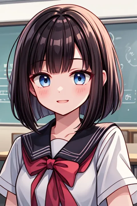
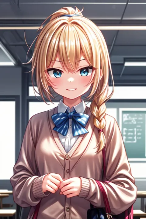
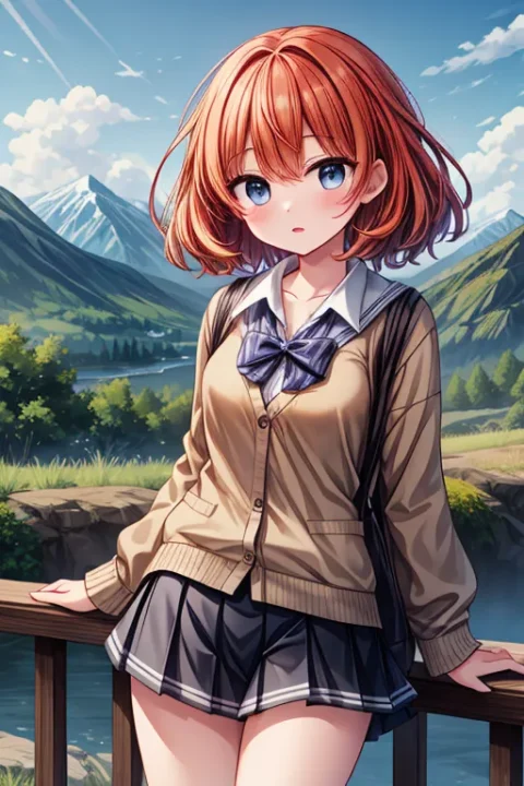
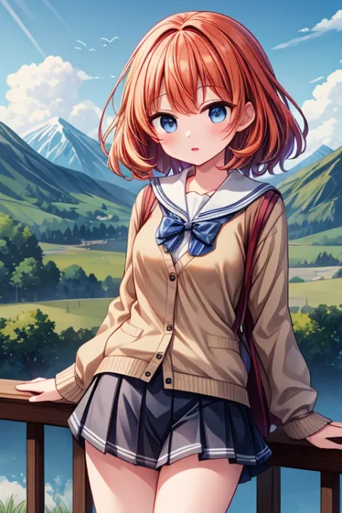
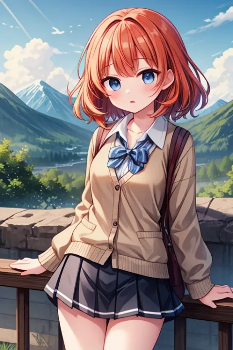
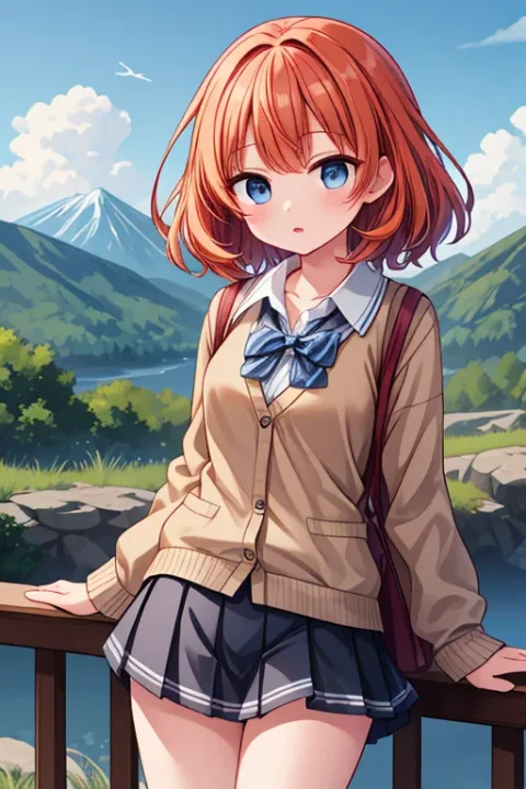
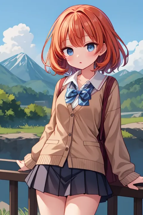
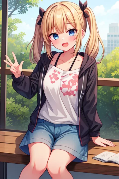
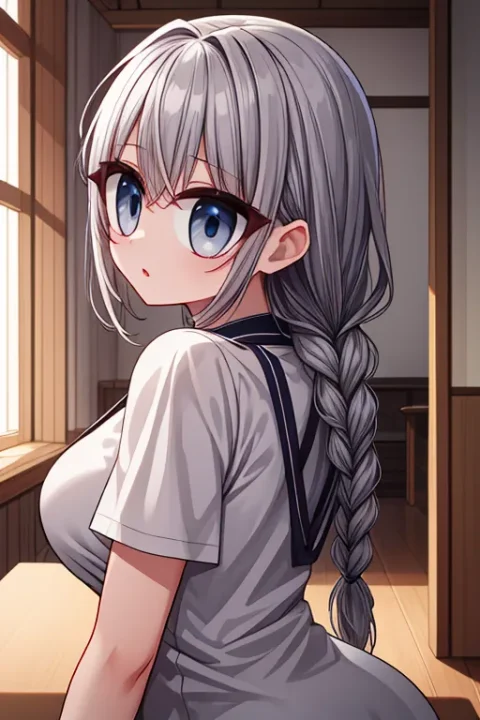
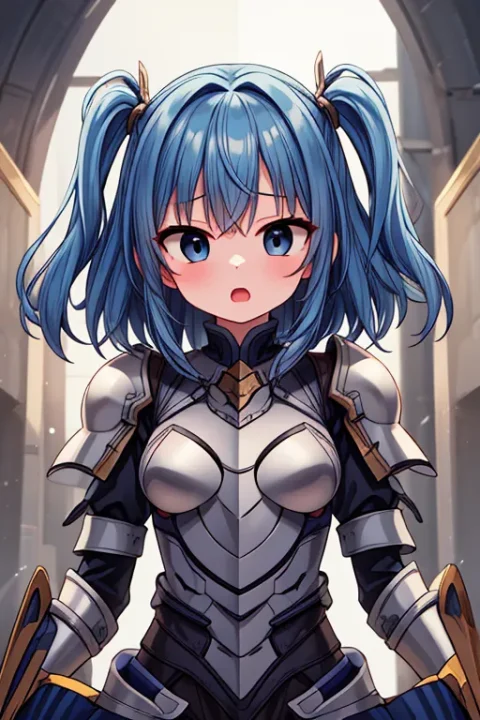
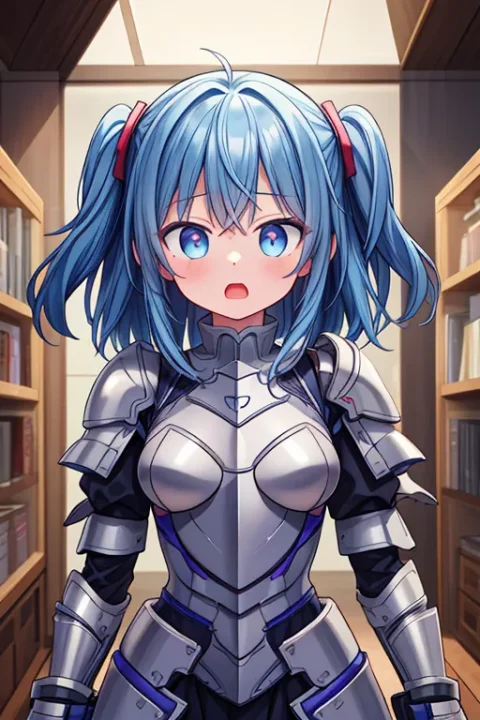
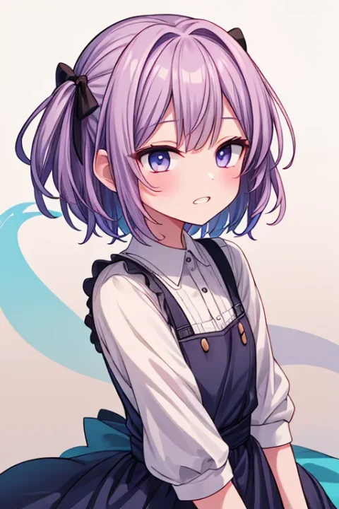
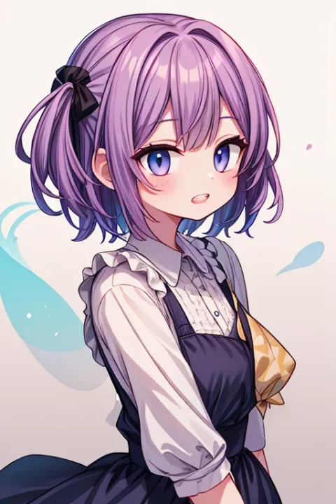
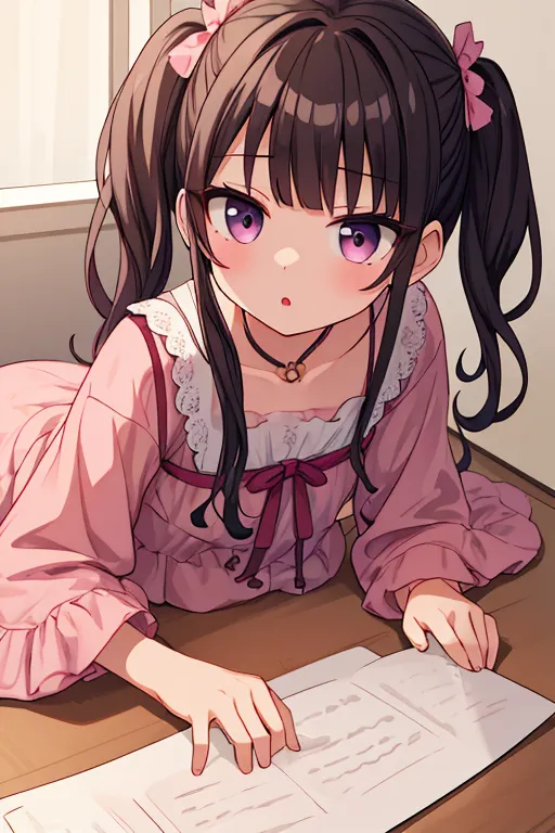
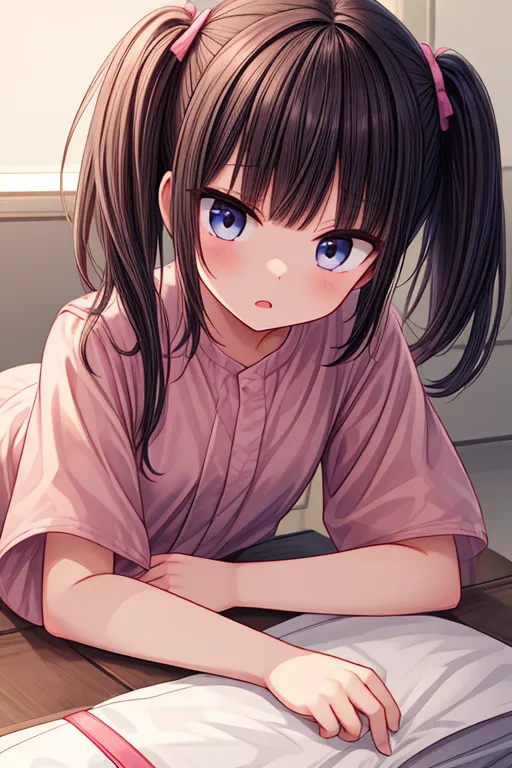
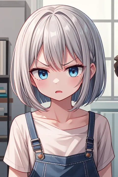
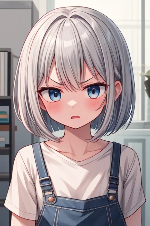
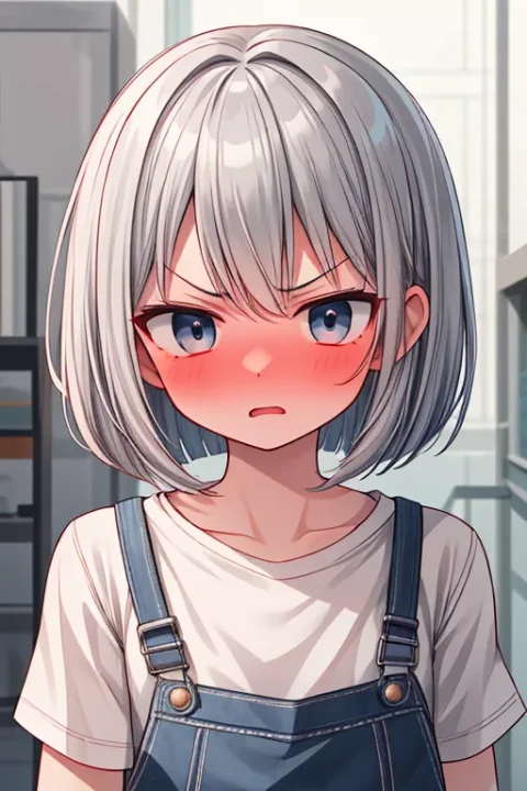
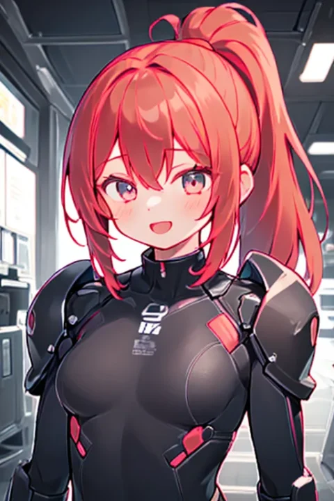
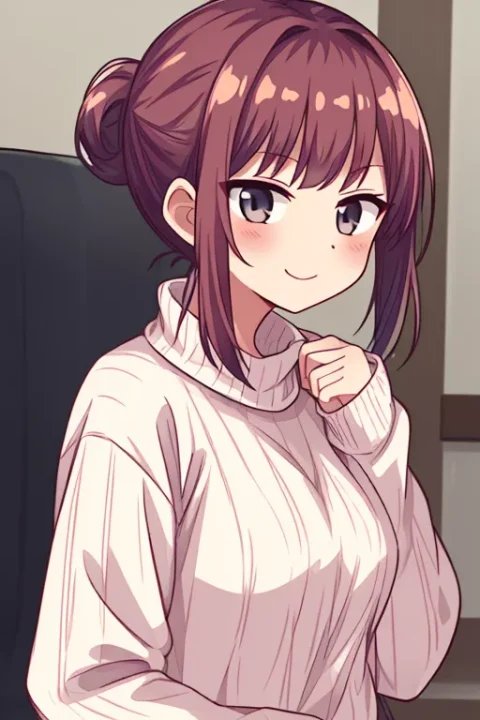
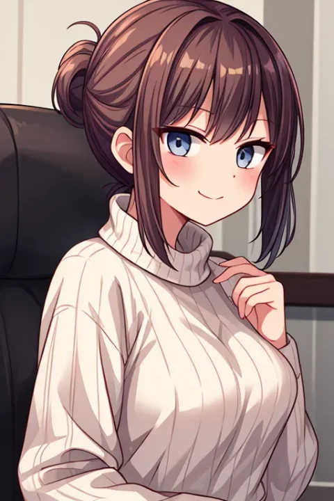
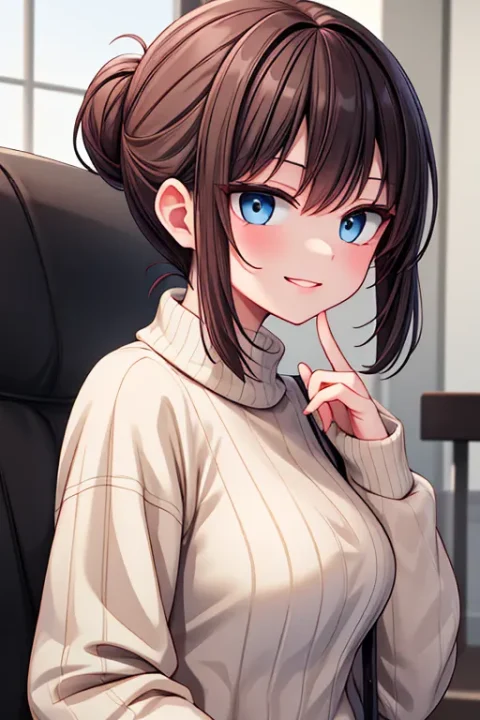
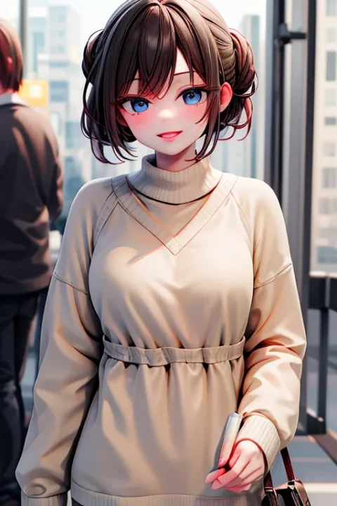
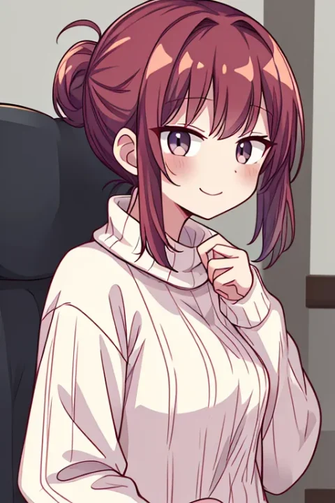
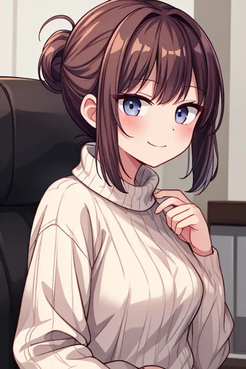
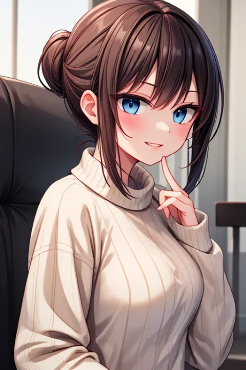
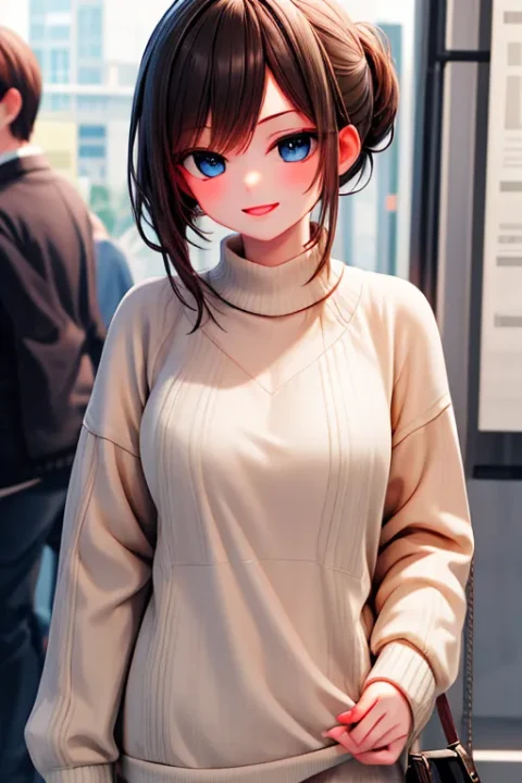
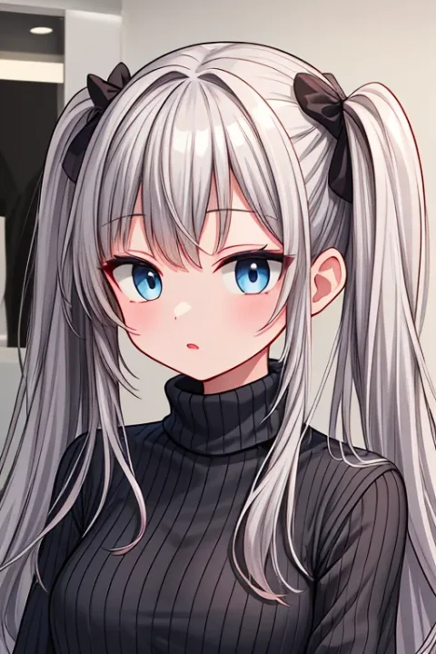
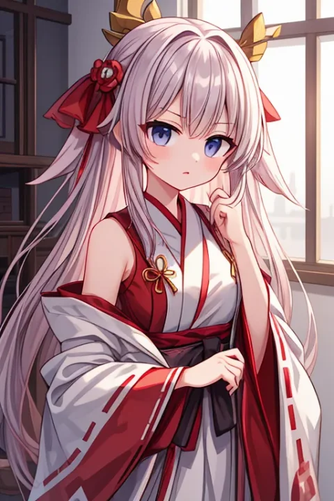
AIイラストを作っていて、好みのモデルを見つけたとしても「もう少し線が太いといいな」「もう少しフラットな方が好みなんだけど」ということがあります。そういったときに、元の絵をなるべく変えずに微調整できるLoRAがあります。
そういった調整系LoRAをHugging Faceで2vXpSwA7さんが公開しています。
フラットにしたり線の太さを調整するものは私もよく使っています。モデルをそのままで利用すると「どこかで見たことがるイラスト」になりがちですが、これらのLoRAで調整すると「自分の絵柄」がなんとなくできてきて良いです。
この記事では、2vXpSwA7さんが公開しているLoRAの効果と使用例を載せておきます。なお、どれもトリガーワードは必要無く、LoRAを適用するだけで効果が出ます。
画像全体を変化させるもの
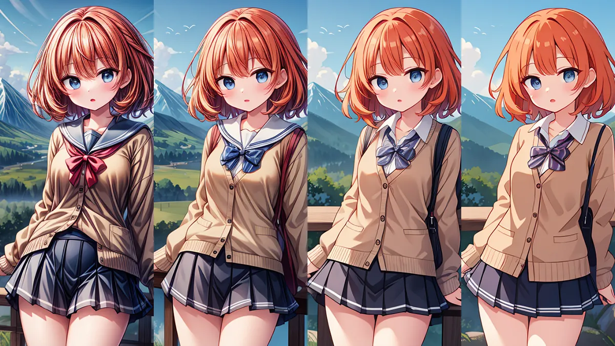
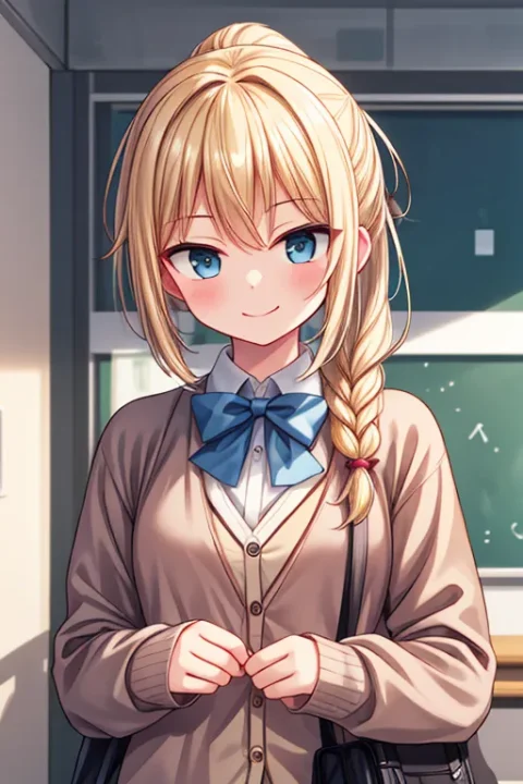
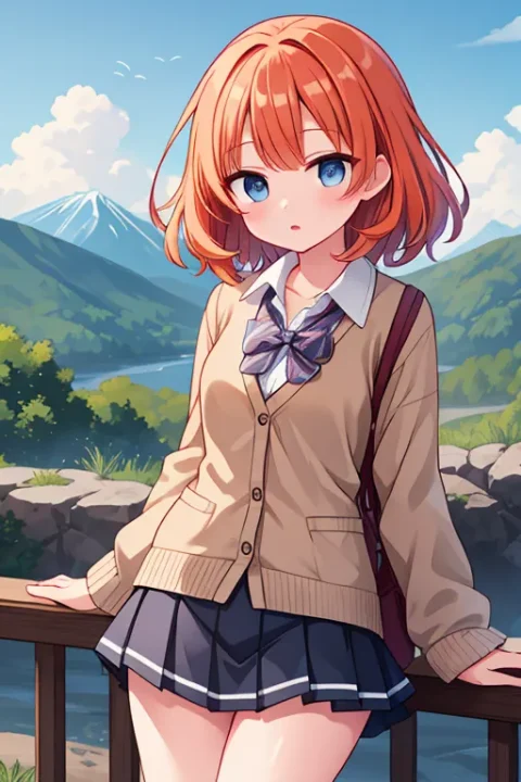
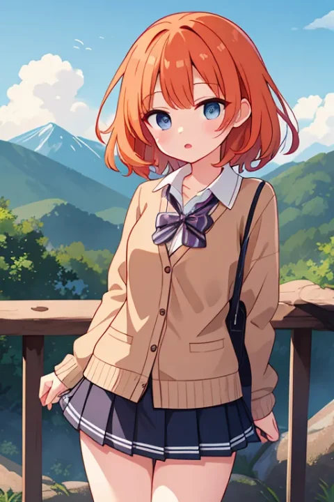
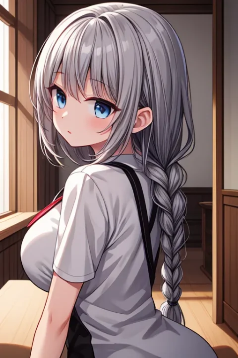
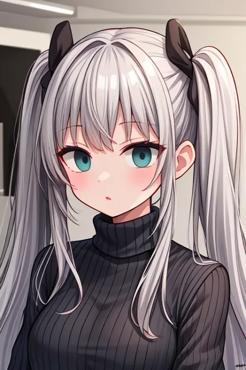
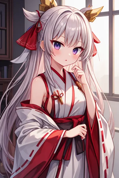
boldline(線を太く)
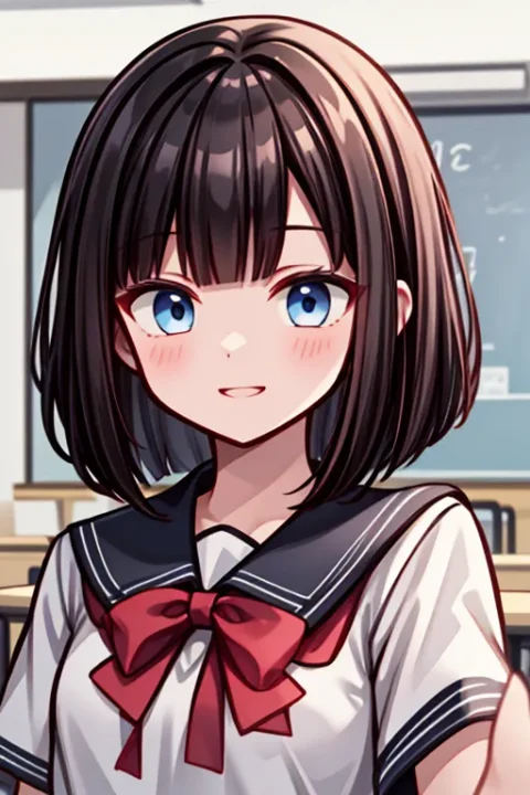
イラストの線が太くなります。マイナスにすると線が細くなり、より繊細になります。
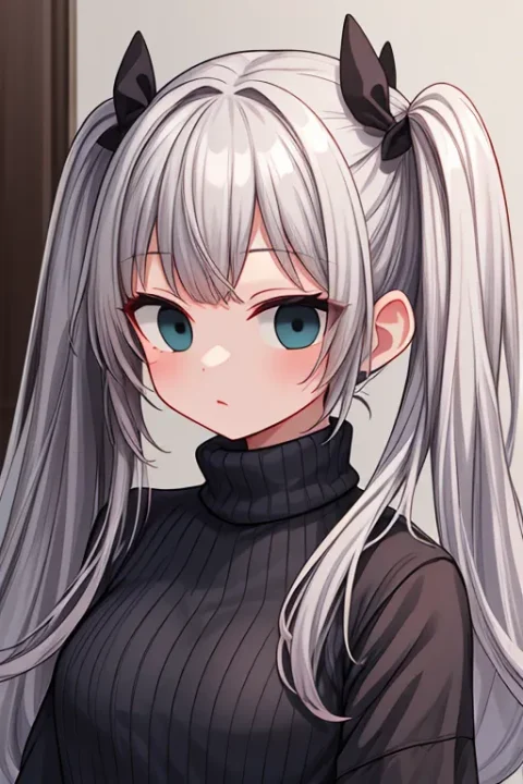
deluster(つや消し)


画像につや消し効果を出します。全体的にのっぺりしてきますね。マイナスにすると逆に光ってるような感じになります。
2は少し効果の出方が変わりますね。マイナスのときにコントラストが派手すぎないようになっているような。
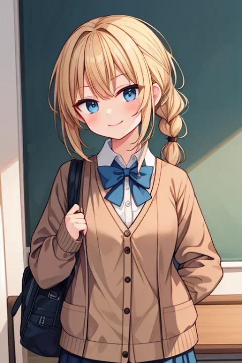
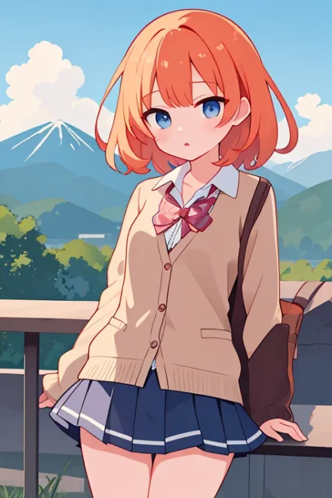
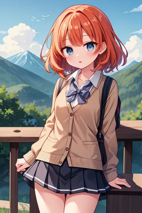
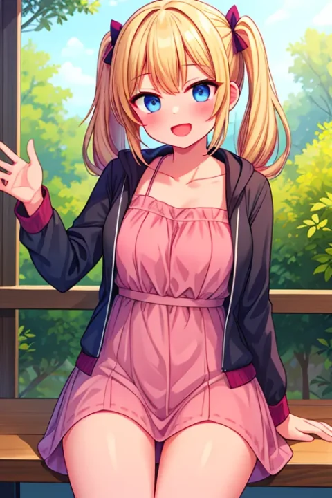
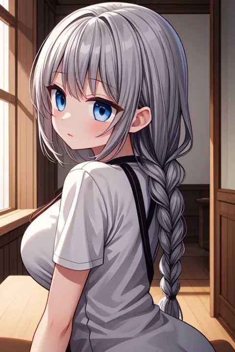
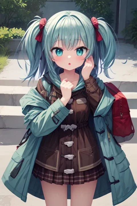
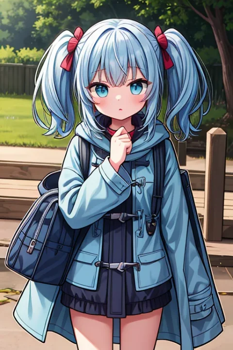
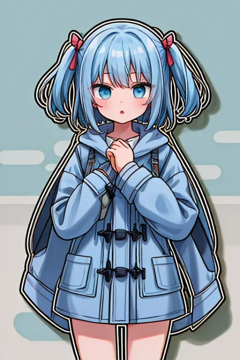
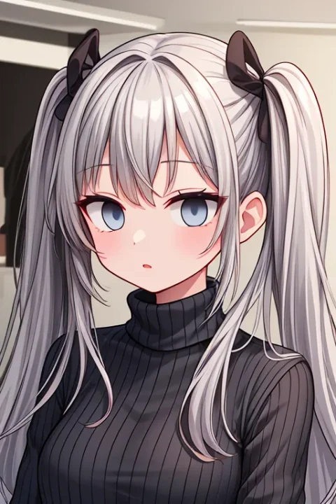
flat(全体をフラットに)
画像全体をフラットにして線を少なくします。マイナス方向で精細になっていきます。ただ細かくなるとともに黒くなりがちなので、dimつきはそれをある程度防いでくれるようです。

flatBG(背景をフラットに)
キャラはそのままに、背景部分をフラットにします。マイナスだと逆に背景が細かくなります。
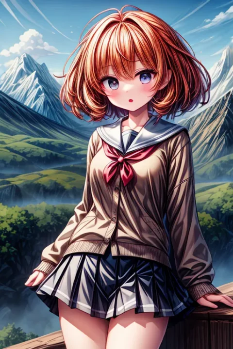
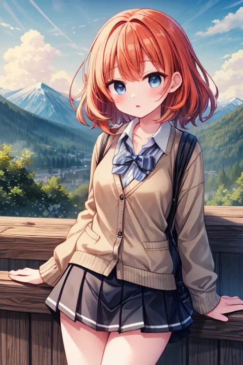
noline(線を消す)
線を細くし、強めれば線がなくなります。boldlineの逆のようなもので、マイナスにすれば線が太くなります。こちらの方が線そのものにアプローチしてる感がありますね。
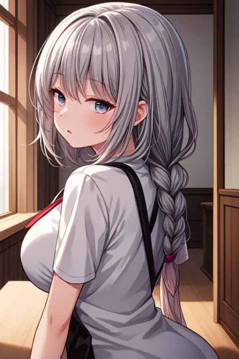
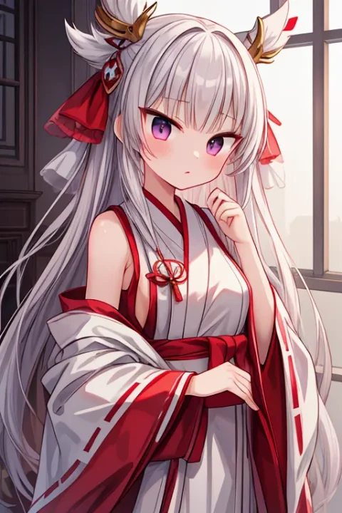
saturation(彩度)

彩度の調整です。プラス方向で鮮やかになり、マイナスでくすんだ色になります。
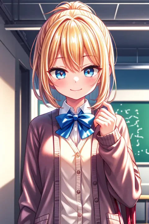
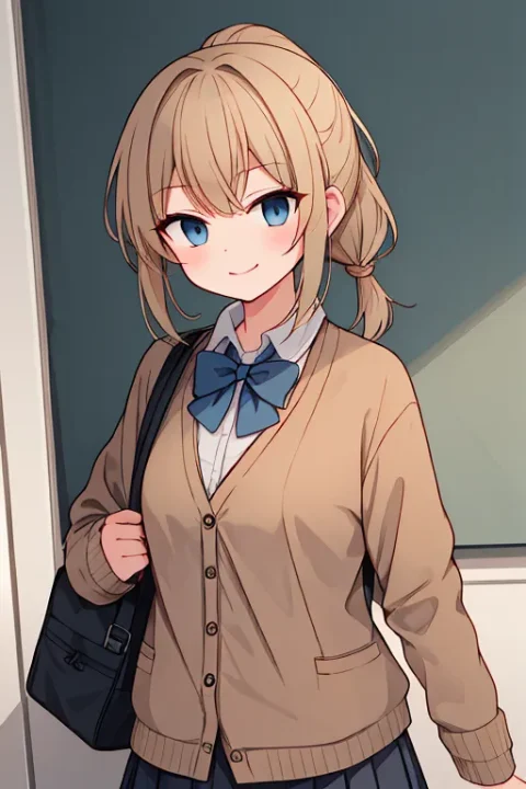
メインのキャラを変化させるもの
agomaru(あごを丸く)
あごの輪郭線が丸くなります。マイナスにすると尖ってきます。効果が緩めなので±1以上ではっきり付けたほうがいいかもしれません。
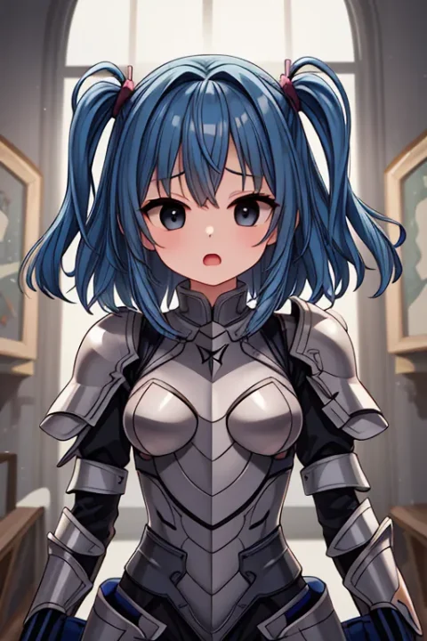
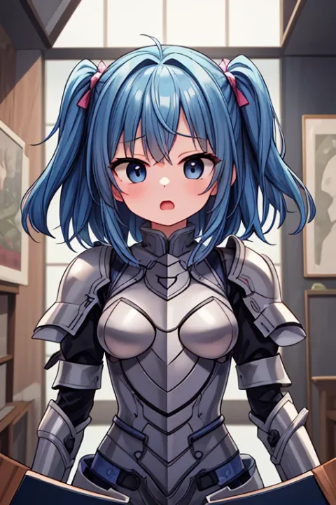
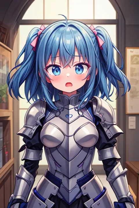
bigeye(目を大きく)
目が大きくなります。マイナスにすると目が小さくなります。

bigeye2はbigeye1よりも影響が大きいようです。0.5でbigeye1の1.5くらいありそうです。
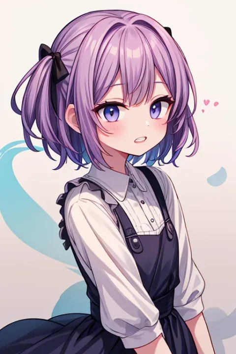
brighter-eye(目を輝かせる)
目の輝きが増します。やり過ぎ注意。マイナスにすると目が暗くなります。目だけでなく全体的な明るさも影響するので注意が必要です。

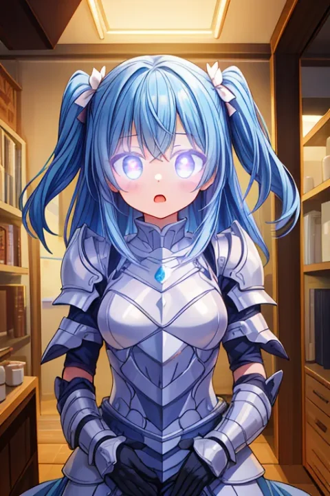
2は1よりも調整されてるようです。好みで選ぶといいですね。
faceage(顔の年齢)

ちょっと効果がわかりにくいのですが、顔つきを変化させて年齢を表現しているようです。プラス方向で顔のパーツ(目)が大きくなり、マイナス方向で小さくなって大人っぽく見えます。
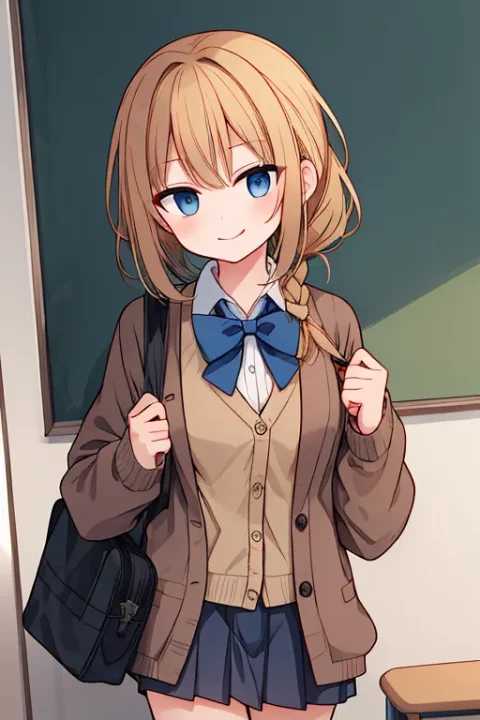
hairdetailer(髪の毛を細かく)
髪の毛をより細かく書き込みます。ただ細かさや立体感は髪の毛以外にも及びます。flatと似たようなものですが全体的な線が細いですね。服や腕など、変化も大きいです。
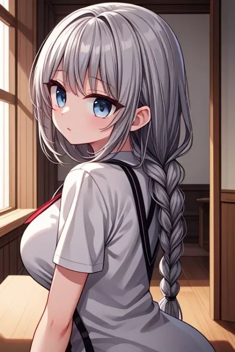
hohoaka(頬を赤くする)
頬を赤くします。AIイラストのモデルはたいていそのままでも頬を赤くしがちですし、プロンプトにblushなどを入れても赤くなりますが、数値で調整できるのは利点です。マイナスに入れると赤みが消えて肌が青白くなっていきます。
kasshokuhada(褐色肌)


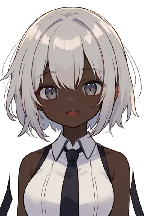
肌を黒くします。けっこう急激に変わるので数値の調整は必須。マイナスにすると肌が白くなります。
lightline(線が光る)
線画部分が発光します。サイバーチックになりますね。マイナスにすると線を含め全体的に黒い雰囲気になります。
outline(縁取り)

人物部分を白く縁取りします。数値を上げると白い縁取りのさらに外に黒い縁取りをします。SDキャラとかに合いそうです。逆にマイナスにすると境界線が細くなり背景との境界が薄くなります。
Testドライブ
ひとつ上のTestドライブには他にも様々なLoRAが入ってます。この中から私もよく使うものなどいくつか紹介します。
nuri-sanDka(3D塗り)
色の塗り方で3D化します。マイナスでフラットになるのでflat系と似ていますが、プラス方向の表現はまるで違います。
01と02の差は微妙ですが、-1.5のときに02のほうがよりアニメ塗りっぽく見えます。
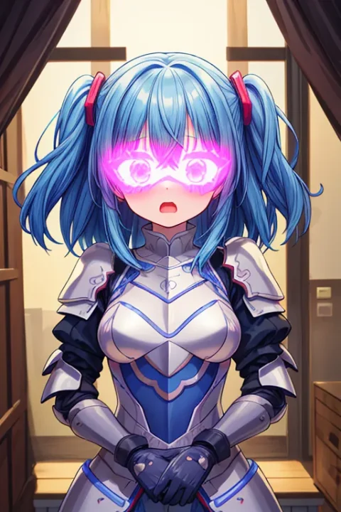
eye-nolight(目のハイライトを消す)
目のハイライトを消します。絶望したときの目や、操られているのを表現するのに使えそうです。02はより暗く、03は明るさを保ったまま、という違いがあります。
eye-turime(ツリ目)

目をツリ目にします。マイナスでタレ目になります。AIイラストの絵はわりとツリ目になりがちで、プロンプトにtaremeやdrooping eyesを入れても効果がイマイチなので、LoRAでやったほうが楽です。
まとめ
これらのLoRAはもちろん複数一緒に使えます。私はよくflatやnuri-sanDkaでフラットにしてnolineで線を太くしてマンガ的な画像にしてます。
今回紹介した以外にもあるので、いろいろ試してみたいですね。